Today's data relates to a store retail agency. This data which is from an online Course i took some time ago of SAS is described below:
Variable
|
Description
|
Saledate_Key
|
Key of date purchase was made
|
Shipping Date Key
|
Key of date purchase was shipped
|
Sales_Quantity
|
Quantity sold
|
Transaction_type
|
Type of transaction (mastercard, email,
paypal..)
|
Sales_key
|
Key of transactional sales
|
Product_Key
|
Key of respective product
|
Customer_key
|
Key of customer
|
Promotion_ind
|
0 if sold in normal price, 1 if sold in
promotion
|
Promotion_key
|
Key of promotiom
|
Product_price
|
Price of product
|
Weight
|
Weight of product (unit, killos,etc)
|
Department_key
|
Key of Product Department
|
Sku_number
|
Key of SKU
|
Product cost
|
Cost of product
|
Sales_amount
|
Total sales amount
|
Objective: My objective in this project is to analyze the data to identify groups of customers with same behaviour regarding purchases (sales amount) of the different products.
To achieve this, i will follow 3 steps:
- Descriptive statistics and visualization
- Clustering interesting/different groups of customers
- Recommend strategies
Let's start.
1. Some Exploratory analysis
Dataset:

#installing packages
install.packages("sas7bdat")
install.packages("stargazer")
install.packages("dplyr")
install_github("easyGgplot2", "kassambara")
install.packages("ave")
install.packages("reshape2")
install.packages("factoextra")
library("sas7bdat")
library("stargazer")
library("dplyr")
library(easyGgplot2)
library("ave")
library(reshape2)
library("factoextra")
#Reading dataset
all_sales=read.sas7bdat("allsales.sas7bdat")
all_sales$Promotion_ind=as.factor(all_sales$Promotion_ind)
str(all_sales)
#Summary Statistics
stargazer(all_sales,omit=c("sales_key","product_key","Customer_key","Promotion_key","Department_key","Sku_number"),type="text", title = "Descriptive statistics", digits=1)

Looking to simple statistics, it seems that there are no strange values in dataset that need to be corrected.
#histograms for continuous variables
par(mfrow=c(1,2))
hist(all_sales$Sales_quantity, freq=T, col="pink", xlab="Quantity", xlim=c(0,20), main="Quantity Histogram")
hist(all_sales$sales_amount, freq=T, col="pink", xlab= "Sales", xlim=c(0,3500), main="Sales Histogram")

hist(all_sales$Sales_quantity, freq=T, col="pink", xlab="Quantity", xlim=c(0,20), main="Quantity Histogram")
hist(all_sales$sales_amount, freq=T, col="pink", xlab= "Sales", xlim=c(0,3500), main="Sales Histogram")
Looking to this histograms we are not really able to see what are most frequent intervals. On Quantity variable, we are able to see that most frequently, products quantity vary between 0 and 5 but let's take a closer look on this interval. Also, on Sales variable we are able to see that amount between 0 and 1000 are most frequent and for that reason I will check closer to this intervals:
#Adjusting x limits
#Adjusting x limits
hist(all_sales$Sales_quantity, freq=T, col="pink", xlab="Quantity", xlim=c(0,5), main="Quantity Histogram")
hist(all_sales$sales_amount, freq=T, col="pink", xlab= "Sales", xlim=c(0,1000), main="Sales Histogram")

Now, I am able to see that most frequently, quantity sold varies between 1 and 2 products and most frequently, sales amount varies between €200 and €400.
Let's check now what is the most used payment method
ggplot(data=na.omit(all_sales), aes(x=Transaction_type)) + ggtitle("Type of Transaction") +
geom_bar(aes(y = 100*(..count..)/sum(..count..)), width = 0.5, na.rm=FALSE)+ ylab("Percentage") +coord_flip() +theme_bw() +theme(panel.border = element_blank(), panel.grid.major = element_blank(), panel.grid.minor = element_blank())

The most common type of payment method is Amex, followed by Mastercard.
Let's check now if products bought in promotion are frequent in this dataset:
#Simple bar chart
barchart(all_sales$Promotion_ind, col="Darkred")
We can see that majority of products bought weren't in Promotion.
ggplot(data=na.omit(all_sales), aes(x=Transaction_type)) + ggtitle("Type of Transaction") +
geom_bar(aes(y = 100*(..count..)/sum(..count..)), width = 0.5, na.rm=FALSE)+ ylab("Percentage") +coord_flip() +theme_bw() +theme(panel.border = element_blank(), panel.grid.major = element_blank(), panel.grid.minor = element_blank())
Let's check now if products bought in promotion are frequent in this dataset:
#Simple bar chart
barchart(all_sales$Promotion_ind, col="Darkred")
We can see that majority of products bought weren't in Promotion.
2. Cluster Analysis
For this cluster analysis, I will be using K-Means algorithm. Since the dataset is in the form of a transactional ds (each row represents a product), and the objective is grouping customers with simillar purchases amount of certain categories of products, I will have to reshape the file:
#Treating data for cluster analysis
group_customers = all_sales %>%
group_by(Customer_key, product) %>%
summarise(sales = sum(sales_amount))
cluster=dcast(group_customers, Customer_key ~ product, value.var="sales", fill=0)
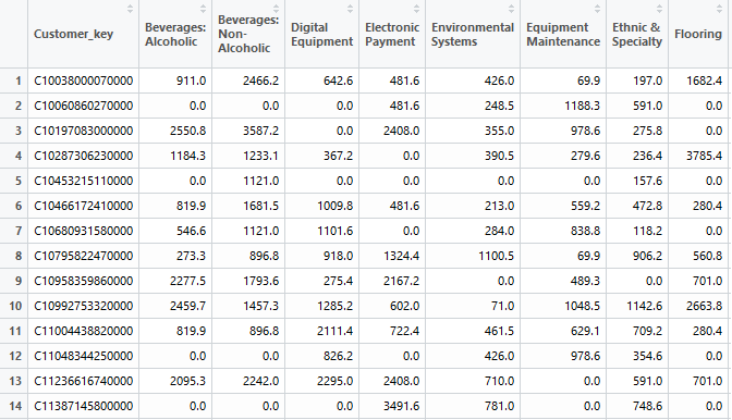
If initally each row of the dataset represented a transaction (product sold), now each row represents a customer and we can see in columns the sales amount spent on each product:
Because name of variables are now too long and to facilitate visualization, i will rename the column names. Here I will show only example of code i used for first three variables:
#Renaming variable names, beginning in the second column
colnames(cluster)[2] <- "beverA"
colnames(cluster)[3] <- "beverNA"
colnames(cluster)[4] <- "digEq"
#Looking to summary statistics
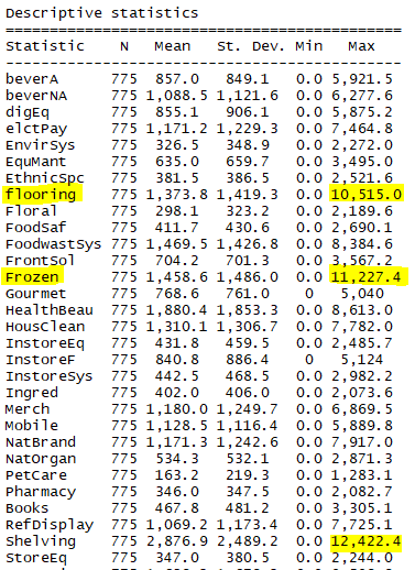
stargazer(cluster,type="text", title = "Descriptive statistics", digits=1)

 We can see that there are several outliers in the variables in study. Once k-means is very sensitive to this outliers, I will remove them (set as NA) and imput mean value of specific variable.
#Dealing with Outliers with a function that detects oultiers as values which are higher than 3*standard deviation:
findOutlier <- function(data, cutoff = 3) {
## Calculate the sd
sds <- apply(data, 2, sd, na.rm = TRUE)
## Identify the cells with value greater than cutoff * sd (column wise)
result <- mapply(function(d, s) {
which(d > cutoff * s)
}, data, sds)
result
}
outliers <- findOutlier(mydata)
#Removing Outliers with a function that receives as parameters the data that we want the outliers to be removed and the outliers found in the function above.
removeOutlier <- function(data, outliers) {
result <- mapply(function(d, o) {
res <- d
res[o] <- NA
return(res)
}, data, outliers)
return(as.data.frame(result))
}
dataFilt <- removeOutlier(mydata, outliers)
#Replacing missing values with Mean
for(i in 1:ncol(dataFilt)){
dataFilt[is.na(dataFilt[,i]), i] <- mean(dataFilt[,i], na.rm = TRUE)
}
#Treating data for cluster analysis
group_customers = all_sales %>%
group_by(Customer_key, product) %>%
summarise(sales = sum(sales_amount))
cluster=dcast(group_customers, Customer_key ~ product, value.var="sales", fill=0)
If initally each row of the dataset represented a transaction (product sold), now each row represents a customer and we can see in columns the sales amount spent on each product:
Because name of variables are now too long and to facilitate visualization, i will rename the column names. Here I will show only example of code i used for first three variables:
#Renaming variable names, beginning in the second column
colnames(cluster)[2] <- "beverA"
colnames(cluster)[3] <- "beverNA"
colnames(cluster)[4] <- "digEq"
#Looking to summary statistics
stargazer(cluster,type="text", title = "Descriptive statistics", digits=1)
We can see that Flooring, Frozen, Shelving and Store Furniture products have highest maximum values of sales.
#Selecting only the variables to the cluster analysis (exclude customer ID)
mydata=cluster[,2:34]
newdata <- mydata[c(-3,-5)]
#Treat data for clustering
boxplot(mydata)
#Dealing with Outliers with a function that detects oultiers as values which are higher than 3*standard deviation:
findOutlier <- function(data, cutoff = 3) {
## Calculate the sd
sds <- apply(data, 2, sd, na.rm = TRUE)
## Identify the cells with value greater than cutoff * sd (column wise)
result <- mapply(function(d, s) {
which(d > cutoff * s)
}, data, sds)
result
}
outliers <- findOutlier(mydata)
#Removing Outliers with a function that receives as parameters the data that we want the outliers to be removed and the outliers found in the function above.
removeOutlier <- function(data, outliers) {
result <- mapply(function(d, o) {
res <- d
res[o] <- NA
return(res)
}, data, outliers)
return(as.data.frame(result))
}
dataFilt <- removeOutlier(mydata, outliers)
#Replacing missing values with Mean
for(i in 1:ncol(dataFilt)){
dataFilt[is.na(dataFilt[,i]), i] <- mean(dataFilt[,i], na.rm = TRUE)
}
Let's check now the boxplots of the variables:
boxplot(dataFilt)
We can see that now outliers were removed. Nevertheless, there are some variables with high varibility and higher interval of values than others, which can be a problem for the results of K-means analysis. For this reason, I will standardize the variables before performing the cluster analysis.
#Standardizing variables
dataFilt=scale(dataFilt)
#Selecting number of clusters to be considered with Elbow Graph
wss <- (nrow(na.omit(dataFilt))-1)*sum(apply(na.omit(dataFilt),2,var))
for (i in 2:15)
wss[i] <- sum(kmeans(na.omit(dataFilt),centers=i)$withinss)
plot(1:15, wss, type="b", xlab="Number of Clusters",ylab="Within groups sum of squares")
for (i in 2:15)
wss[i] <- sum(kmeans(na.omit(dataFilt),centers=i)$withinss)
plot(1:15, wss, type="b", xlab="Number of Clusters",ylab="Within groups sum of squares")
Looking to the graph, I will pick best solution as k=5 clusters. Nevertheless, I will also conduct the analysis with k=6 clusters and k=4 clusters and based on interpretation last solution will be selected.
#Running kmeans with different numbers of clusters
fit4 <- kmeans(dataFilt, 4)
fit5 <- kmeans(dataFilt, 5)
fit6 <- kmeans(dataFilt, 6)
#Visualizing cluster centroids and understand patterns
install.packages("toaster")
library(toaster)
createCentroidPlot( fit4, format="line", groupByCluster=TRUE, coordFlip = TRUE,title = "Centroids")
fit4 <- kmeans(dataFilt, 4)
fit5 <- kmeans(dataFilt, 5)
fit6 <- kmeans(dataFilt, 6)
#Visualizing cluster centroids and understand patterns
install.packages("toaster")
library(toaster)
createCentroidPlot( fit4, format="line", groupByCluster=TRUE, coordFlip = TRUE,title = "Centroids")

Cluster 1&2 (n=165+163)
This segments represents customers with highest value for the company.
They are simillar in respect to sales amount when comparing all four clusters, but they differ in the categories that bring more value to the company. We can see that while cluster 1 has customers that spend a lot in Pharmacy, Natural Organic, Merchandising, or Instore Systems, Cluster 2 has customers where this categories represents lowest amount of sales spent in. The objective of the company should be to focus on the retention and satisfaction of this clients through strategies that make them feel emotionally connected and make them consider everything they would lose if they left (eg custom packaging for home, sending a celebration card and small supply of anniversary, delivery of priority orders). Adittionaly, cross sell campaings could also be used to increase sales amount in worst categories of each group.
Cluster 3 (n=215)
This segment is made up of around 27% of the total number of customers and is where "average" customers are included (with an actual value much higher than the first segment but much lower than the third and fourth segments).
Strategies to promote the growth of this group can include cross-selling campaigns. Using as example Food categories, and taking in consideration that they spend more in categories such as Natural Organic, Gourmet or Frozen and that they spend less in categories such as Non alcoholic beverages, do campaigns like"Buy three packs of Ice Tea and you can receive a free product from our Gourmet list at your choice" , could make the amount sold higher and the customer satisfied.
Cluster 4 (n=232)
This cluster represents customers with sales amount below average in every products and thus, customers with lower value for the company. Strategies to grow their potential include the creation of loyalty campaings (eg accumulation of points for each € spent and possibility to convert these points on purchases or special direct promotions) on categories they buy most.


No comments:
Post a Comment