Today I am developing my first project in Data Science Training with a dataset regarding a fictional insurance company in Portugal. In the ABT (Analytic Based Table) I have data regarding a sample of 10.290 Customers.
For this first post, the ideia is to develop a descriptive analysis in R with summary statistics and some visualization. Let's start!
For this first post, the ideia is to develop a descriptive analysis in R with summary statistics and some visualization. Let's start!
For each customer, the following variables are available:
Variable
|
Description
|
ID
|
ID
|
First_Policy
|
Year of the Customer's first policy
|
Birthday
|
Customer's Age
|
Education
|
Academic Degree (Categorical)
|
Salary
|
Gross Monthly Salary (€)
|
Area
|
Living Area (Categorical)
|
Children
|
Binary Variable (Y=1)
|
CMV
|
Customer Monetary Value
|
Claims
|
Claims Rate
|
Motor
|
Premiums (€) in LOB: Motor
|
Household
|
Premiums (€) in LOB: Household
|
Health
|
Premiums (€) in LOB: Health
|
Life
|
Premiums (€) in LOB: Life
|
Work_Compensation
|
Premiums (€) in LOB: Work Compensations
|
#Installing some relevant packages for specific functions
install.packages("stargazer") #Summary statisticslibrary(stargazer)
install.packages("ggplot2") #Graphics
library(ggplot2)
#Read dataset and show information about the variables
insurance=read.csv("A2Z_Insurance.csv",header=T, sep=";")
str(insurance)
Wrangling to do...
insurance$Customer.Identity=as.character(insurance$Customer.Identity)
insurance$First.Policy.s.Year=as.factor(insurance$First.Policy.s.Year)
insurance$Has.Children..Y.1.=as.factor(insurance$Has.Children..Y.1.)
insurance$Geographic.Living.Area=as.factor(insurance$Geographic.Living.Area)
Exploratory data analysis
1. Summary Statistics
#Let's now retreive some summary statistics. The first line shows statistics for every variable in dataset. As I want to download the results and to be able to see it in a more "organized" way, I use stargazer function from Stargazer package to retreive the summary and i will save it in csv file called "Estatisticas.csv". summary(insurance)
stargazer(insurance, type = "text", title="Descriptive statistics", digits=1, out="Estatisticas.csv")
#As we can see in the output, Customer Age has a minimum value of 15 and a miximum value of 988. This values represent wrong data since :
1) To be able to make an insurance policy, you have to be 18+
2) No one has 988 years old
Claims Rate is given in % and maximum value presented is 256.2 which also doesn't make sense.
Premiums represents the payment customers do regarding respective Insurance (motor, household, health, etc). Some variables of Premium shows negative values so I'll consider them as wrong data.
Let's treat wrong values. In first line, and second line, I'm telling R to change the variable Age to NA (no value, or missing value) if age is >100 or age is <18. Ifelse function in very intiuitive as it works as "if" function in Excel. I applied same methodology for Premiums variables.
insurance$Customer.Age=ifelse(insurance$Customer.Age>100,NA,insurance$Customer.Age)
insurance$Customer.Age=ifelse(insurance$Customer.Age<18,NA,insurance$Customer.Age)
insurance$Claims.Rate=ifelse(insurance$Claims.Rate>100,NA,insurance$Claims.Rate)
insurance$Premiums.in.LOB..Motor=ifelse(insurance$Premiums.in.LOB..Motor<0,NA,insurance$Premiums.in.LOB..Motor)
insurance$Premiums.in.LOB..Household=ifelse(insurance$Premiums.in.LOB..Household<0,NA,insurance$Premiums.in.LOB..Household)
insurance$Premiums.in.LOB..Health=ifelse(insurance$Premiums.in.LOB..Health<0,NA,insurance$Premiums.in.LOB..Health)
insurance$Premiums.in.LOB...Life=ifelse(insurance$Premiums.in.LOB...Life<0,NA,insurance$Premiums.in.LOB...Life)
insurance$Premiums.in.LOB..Work.Compensations=ifelse(insurance$Premiums.in.LOB..Work.Compensations<0,NA,insurance$Premiums.in.LOB..Work.Compensations)
#After doing the changes, and running again summary statistics I was able to see that for some Premium variables, minimum value are 0. Doesn't really make sense that a customer pays €0 for an insurance. Nevertheless, and since I'm not able to check how much actually customer payed, i will let the values.
2. Visualization
#Let's now plot some Histograms for continuous variables. I'll use ggplot function from ggplo2 package.
#Histogram for Premiums Motor
plot1=ggplot(data=insurance, aes(insurance$Premiums.in.LOB..Motor)) +
geom_histogram(breaks=seq(0, 700, by = 100),
col="red",
fill="green",
alpha = .2) +
labs(title="Histogram") +
labs(x="Premium_Motor", y="Count") +
xlim(c(0,700)) +theme_bw()+ theme(panel.border = element_blank(), panel.grid.major = element_blank(), panel.grid.minor = element_blank())
#Histogram for Premiums Life
plot2=ggplot(data=insurance, aes(insurance$Premiums.in.LOB...Life)) +
geom_histogram(breaks=seq(0, 350, by = 50),
col="red",
fill="green",
alpha = .2) +
labs(title="Histogram") +
labs(x="Premium_Life", y="Count") +
xlim(c(0,350)) +theme_bw()+ theme(panel.border = element_blank(), panel.grid.major = element_blank(),panel.grid.minor = element_blank())
#Histogram for Premiums Household
plot3=ggplot(data=insurance, aes(insurance$Premiums.in.LOB..Health)) +
geom_histogram(breaks=seq(0, 500, by = 50),
col="red",
fill="green",
alpha = .2) +
labs(title="Histogram") +
labs(x="Premium_Household", y="Count") +
xlim(c(0,500)) +theme_bw()+ theme(panel.border = element_blank(), panel.grid.major = element_blank(), panel.grid.minor = element_blank())
#Histogram for Premiums Health
plot4=ggplot(data=insurance, aes(insurance$Premiums.in.LOB..Health)) +
geom_histogram(breaks=seq(0, 500, by = 50),
col="red",
fill="green",
alpha = .2) +
labs(title="Histogram") +
labs(x="Premium_Health", y="Count") +
xlim(c(0,500)) +theme_bw()+ theme(panel.border = element_blank(), panel.grid.major = element_blank(), panel.grid.minor = element_blank())
#Histogram for Premiums Work Compensations
plot5=ggplot(data=insurance, aes(insurance$Premiums.in.LOB..Work.Compensations)) +
geom_histogram(breaks=seq(0, 500, by = 50),
col="red",
fill="green",
alpha = .2) +
labs(title="Histogram") +
labs(x="Premium_Work", y="Count") +
xlim(c(0,500)) +theme_bw()+ theme(panel.border = element_blank(), panel.grid.major = element_blank(), panel.grid.minor = element_blank())
#As I want to display the histograms all in the same window, I'll install gridExtra package to use grid.arrange function. I'll plot all histograms in a window of 2x3 dimension.
require(gridExtra)
grid.arrange(plot1, plot2, plot3, plot4, plot5,nrow=2,ncol=3)
#We can see by ploting the histograms that typically, Premium Motor payments were around €200 and €400. In the case of Premium Life and Premium work this value is lower : between €0 and €50. Premium Hosehould payments and Premium Health payments were typically around €100 and €200.
#Histogram for Gross Monthly Salary
p1=ggplot(data=insurance, aes(insurance$Gross.Monthly.Salary)) +
geom_histogram(breaks=seq(0, 10000, by = 1000),
col="red",
fill="green",
alpha = .2) +
labs(title="Histogram") +
labs(x="Gross Monthly Salary", y="Count") +
xlim(c(0,10000)) +theme_bw()+ theme(panel.border = element_blank(), panel.grid.major = element_blank(), panel.grid.minor = element_blank())
#Histogram for Customer Monetary Value
p2=ggplot(data=insurance, aes(insurance$Gross.Monthly.Salary)) +
geom_histogram(breaks=seq(-20, 12000, by = 1000),
col="red",
fill="green",
alpha = .2) +
labs(title="Histogram") +
labs(x="Monetary Value", y="Count") +
xlim(c(-20,12000)) +theme_bw()+ theme(panel.border = element_blank(), panel.grid.major = element_blank(),panel.grid.minor = element_blank())
#Histogram for Claims Rate
p3=ggplot(data=insurance, aes(insurance$Claims.Rate)) +
geom_histogram(breaks=seq(0, 2.5, by = 0.2),
col="red",
fill="green",
alpha = .2) +
labs(title="Histogram") +
labs(x="Claims_Rate", y="Count") +
xlim(c(0,2.5)) +theme_bw()+ theme(panel.border = element_blank(), panel.grid.major = element_blank(), panel.grid.minor = element_blank())
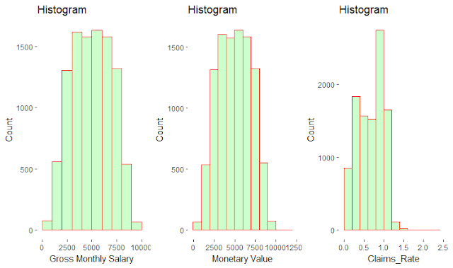
grid.arrange(p1,p2,p3,ncol=3)
#Gross Monthly Salary and Monetary Values between €3000 and €6000 are quite frequent and Claims Rate values are typically between 0.8 and 1.0
#Let's now plot some Bar plots for categorical variables.
#Residential Area
plot6 = ggplot(data=subset(insurance,!is.na(Geographic.Living.Area)), aes(x=Geographic.Living.Area)) + ggtitle("Living Area") + xlab("Area") +
geom_bar(aes(y = 100*(..count..)/sum(..count..)), width = 0.5, na.rm=FALSE)+ ylab("Percentage") +theme_bw()+ theme(panel.border = element_blank(), panel.grid.major = element_blank(), panel.grid.minor = element_blank())
#Education Degree
plot7= ggplot(data=subset(insurance,Educational.Degree!=0), aes(x=Educational.Degree)) + ggtitle("Educational Degree") + xlab("Educational Degree") +
geom_bar(aes(y = 100*(..count..)/sum(..count..)), width = 0.5, na.rm=FALSE)+ ylab("Percentage") + coord_flip() +theme_bw()+ theme(panel.border = element_blank(), panel.grid.major = element_blank(), panel.grid.minor = element_blank())
#Has Children
plot8= ggplot(data=subset(insurance,!is.na(Has.Children..Y.1.)), aes(x=Has.Children..Y.1.)) + ggtitle("Children") + xlab("Children") +
geom_bar(aes(y = 100*(..count..)/sum(..count..)), width = 0.5, na.rm=FALSE)+ ylab("Percentage") +theme_bw()+ theme(panel.border = element_blank(), panel.grid.major = element_blank(),panel.grid.minor = element_blank())
grid.arrange(plot6,plot8,ncol=2)
plot7
We can see that the majority of the customers (around 40%) live in Area 4 and have children (around 70%).
#Regarding Educational Degree, we can see that the highest percentage (around 50%) of customers have BSc or MSc degree, followed by High School (around 35%).
#Histogram for Premiums Motor
plot1=ggplot(data=insurance, aes(insurance$Premiums.in.LOB..Motor)) +
geom_histogram(breaks=seq(0, 700, by = 100),
col="red",
fill="green",
alpha = .2) +
labs(title="Histogram") +
labs(x="Premium_Motor", y="Count") +
xlim(c(0,700)) +theme_bw()+ theme(panel.border = element_blank(), panel.grid.major = element_blank(), panel.grid.minor = element_blank())
#Histogram for Premiums Life
plot2=ggplot(data=insurance, aes(insurance$Premiums.in.LOB...Life)) +
geom_histogram(breaks=seq(0, 350, by = 50),
col="red",
fill="green",
alpha = .2) +
labs(title="Histogram") +
labs(x="Premium_Life", y="Count") +
xlim(c(0,350)) +theme_bw()+ theme(panel.border = element_blank(), panel.grid.major = element_blank(),panel.grid.minor = element_blank())
#Histogram for Premiums Household
plot3=ggplot(data=insurance, aes(insurance$Premiums.in.LOB..Health)) +
geom_histogram(breaks=seq(0, 500, by = 50),
col="red",
fill="green",
alpha = .2) +
labs(title="Histogram") +
labs(x="Premium_Household", y="Count") +
xlim(c(0,500)) +theme_bw()+ theme(panel.border = element_blank(), panel.grid.major = element_blank(), panel.grid.minor = element_blank())
#Histogram for Premiums Health
plot4=ggplot(data=insurance, aes(insurance$Premiums.in.LOB..Health)) +
geom_histogram(breaks=seq(0, 500, by = 50),
col="red",
fill="green",
alpha = .2) +
labs(title="Histogram") +
labs(x="Premium_Health", y="Count") +
xlim(c(0,500)) +theme_bw()+ theme(panel.border = element_blank(), panel.grid.major = element_blank(), panel.grid.minor = element_blank())
#Histogram for Premiums Work Compensations
plot5=ggplot(data=insurance, aes(insurance$Premiums.in.LOB..Work.Compensations)) +
geom_histogram(breaks=seq(0, 500, by = 50),
col="red",
fill="green",
alpha = .2) +
labs(title="Histogram") +
labs(x="Premium_Work", y="Count") +
xlim(c(0,500)) +theme_bw()+ theme(panel.border = element_blank(), panel.grid.major = element_blank(), panel.grid.minor = element_blank())
#As I want to display the histograms all in the same window, I'll install gridExtra package to use grid.arrange function. I'll plot all histograms in a window of 2x3 dimension.
require(gridExtra)
grid.arrange(plot1, plot2, plot3, plot4, plot5,nrow=2,ncol=3)
#Histogram for Gross Monthly Salary
p1=ggplot(data=insurance, aes(insurance$Gross.Monthly.Salary)) +
geom_histogram(breaks=seq(0, 10000, by = 1000),
col="red",
fill="green",
alpha = .2) +
labs(title="Histogram") +
labs(x="Gross Monthly Salary", y="Count") +
xlim(c(0,10000)) +theme_bw()+ theme(panel.border = element_blank(), panel.grid.major = element_blank(), panel.grid.minor = element_blank())
#Histogram for Customer Monetary Value
p2=ggplot(data=insurance, aes(insurance$Gross.Monthly.Salary)) +
geom_histogram(breaks=seq(-20, 12000, by = 1000),
col="red",
fill="green",
alpha = .2) +
labs(title="Histogram") +
labs(x="Monetary Value", y="Count") +
xlim(c(-20,12000)) +theme_bw()+ theme(panel.border = element_blank(), panel.grid.major = element_blank(),panel.grid.minor = element_blank())
#Histogram for Claims Rate
p3=ggplot(data=insurance, aes(insurance$Claims.Rate)) +
geom_histogram(breaks=seq(0, 2.5, by = 0.2),
col="red",
fill="green",
alpha = .2) +
labs(title="Histogram") +
labs(x="Claims_Rate", y="Count") +
xlim(c(0,2.5)) +theme_bw()+ theme(panel.border = element_blank(), panel.grid.major = element_blank(), panel.grid.minor = element_blank())
grid.arrange(p1,p2,p3,ncol=3)
#Gross Monthly Salary and Monetary Values between €3000 and €6000 are quite frequent and Claims Rate values are typically between 0.8 and 1.0
#Let's now plot some Bar plots for categorical variables.
#Residential Area
plot6 = ggplot(data=subset(insurance,!is.na(Geographic.Living.Area)), aes(x=Geographic.Living.Area)) + ggtitle("Living Area") + xlab("Area") +
geom_bar(aes(y = 100*(..count..)/sum(..count..)), width = 0.5, na.rm=FALSE)+ ylab("Percentage") +theme_bw()+ theme(panel.border = element_blank(), panel.grid.major = element_blank(), panel.grid.minor = element_blank())
#Education Degree
plot7= ggplot(data=subset(insurance,Educational.Degree!=0), aes(x=Educational.Degree)) + ggtitle("Educational Degree") + xlab("Educational Degree") +
geom_bar(aes(y = 100*(..count..)/sum(..count..)), width = 0.5, na.rm=FALSE)+ ylab("Percentage") + coord_flip() +theme_bw()+ theme(panel.border = element_blank(), panel.grid.major = element_blank(), panel.grid.minor = element_blank())
#Has Children
plot8= ggplot(data=subset(insurance,!is.na(Has.Children..Y.1.)), aes(x=Has.Children..Y.1.)) + ggtitle("Children") + xlab("Children") +
geom_bar(aes(y = 100*(..count..)/sum(..count..)), width = 0.5, na.rm=FALSE)+ ylab("Percentage") +theme_bw()+ theme(panel.border = element_blank(), panel.grid.major = element_blank(),panel.grid.minor = element_blank())
grid.arrange(plot6,plot8,ncol=2)
plot7
We can see that the majority of the customers (around 40%) live in Area 4 and have children (around 70%).
#Regarding Educational Degree, we can see that the highest percentage (around 50%) of customers have BSc or MSc degree, followed by High School (around 35%).


No comments:
Post a Comment