Sunday 22 April 2018

6th Project - Decision Tree

Today's project is about building a decision tree in a retail dataset with the core business of selling Wines (also on online channel). In order to understand what drives the decision of a customer to buy a Large Wine Rack of 100$ (target variable LGRack),and to build a model capable of predicting which customers have higher probability of buying the accessory, I will use a classification tree algorithm. I will start with an exploratory data analysis with a package I found really helpfull specially for the analysis I will perform today. The description of the dataset is below:
#Intalling Packages
install.packages("SmartEDA") #For Exploratory data analysis
library("SmartEDA")

#Read dataset
data=read.csv("Book1.csv",head=T, sep=";")

#Data preprocessing - Set binary variables as factors (including CustID since this will not be used in any analysis)
data$Custid=as.factor(data$Custid)
data$Kidhome=as.factor(data$Kidhome)
data$Teenhome=as.factor(data$Teenhome)
data$SMRack=as.factor(data$SMRack)
data$LGRack=as.factor(data$LGRack)
data$Humid=as.factor(data$Humid)
data$Spcork=as.factor(data$Spcork)
data$Bucket=as.factor(data$Bucket)
data$Access=as.factor(data$Access)

#First table information
ExpData(data=data,type=1,DV=NULL)
We can see that the dataset has 10.000 observations, 26 variables (17 are numeric and 9 are factor variables). We can also see that there are no missing values in this dataset. Let's now look at some statistics. What is good in this package is the ability of producing summary statistics and visualization considering our target variable in study (in this case LGRack):

#Summary statistics for continuous variables
stat=ExpNumStat(data,by=c("GA"),gp="LGRack",Qnt=NULL,MesofShape=2,Outlier=FALSE,round=3)
#to exclude some information provided in the summary table of ExpNumStat() function that I don't want to visualize.
stat=stat[,-c(4,5,6,7,8,9,10,17)] 
In the output table presented here, I didn't include all variables (because it's a large table) but we can see here some statistics like minimum, maximum, mean, media, standard deviation and so on for each variable (All) and also for the cases when customers bought LGRack (LGRack:1) and when customers didn't buy the LGRack (LGRack:0). When looking to this summary statistics, we are able to check if there are strange values that might be errors: for example in Age variable, in some datasets i previously analysed, I found customers with 99 years old which was of course an error. In this dataset, I didn't find any strange values, except for the Web visits and Webpurchases minimum value: In webvisit variable, minimum value is 0 which means that in the dataset we have customer(s) that didn't visit the website. Well if that's the case, then we should also have in WebPurchase variable (% purchases made in website) 0 as minimum value. Let's further analyse this customers:
#Analysing customers with webvisits=0
stat_webpurch=ExpNumStat(subset(data,WebVisit==0),by=c("A"),Qnt=NULL,MesofShape=2,Outlier=FALSE,round=3)
stat_webpurch=stat_webpurch[,-c(4,5,6,7,8,9,10,17)]
We can see that customers that have no vistis to the site (Webvisit=0) have minimum value of Webpurchase variable = 5, which does not make sense. So I will exclude this 32 customers from the dataset.
#Excluding customers with Webvisit <=0
data=subset(data,WebVisit>0)

Let's now do some visualization:
####Visualization###
#Barplots for categorical variables
ExpCatViz(data,gp=NULL,fname=NULL,clim=10,margin=2,Page = c(3,3))
We can see that in what concerns LGRack, the majority of the customers didn't buy it (93%). The same trend with the other accessories is seen, since in every variable we can see that the higher percentage corresponds to "customer didn't buy". In webvisits, we can see that the majority of customers visted the website on average 7 times per month. 

#Continuous variables taking into account target variable
ExpNumViz(data,gp="LGRack",type=1,nlim=NULL,fname=NULL,col=c("pink","yellow","orange"),Page=c(3,3))
From the output we can see that customers who bought the LGRack have higher income, higher monetary value, are elder, and also more frequent customers. We are also able to see that in some variables we have outliers, like on Income, Monetary,Frquency,  LTV, Recency and Perdeal.

Now that we have made some exploratory analysis (this is not the core of the post so I didn't get deep on this topic), let's build our tree, after excluding from the analysis the other categorical variables and after changing the variables which are represented in percentages % to absolute value:

#Exlude categorical variables (except LGRack) from dataset
data=data[,-c(1,6,7,21,23,24,25,26)]
#Change variables
  for(i in 9:16){
  data[,i]=(data$Monetary*data[,i])/100
}

Because our target variable (LGRack) is binary (0=not bought, 1=bought), we will build a classification tree. Let us now see how to construct the classification tree in R. The significance of the sample used to obtain the model is essential to have a minimum of guarantees of the representativeness of the model constructed. So it makes no sense to get a decision tree using half a dozen examples of decisions. In fact, the larger the sample used the better. Before we start, we should think on a question:


What confidence can we have in the performance of the model we are about to build?
One of the most practical ways of responding to this question is to test the model using new cases of customer decisions (bought or not bought), and to account for the incorrect decisions, when compared with the customer decisions made (predicted) by the decision tree.
One way to simulate the existence of more cases to test our model is to divide the cases that we have into two sub-sets: one to obtain the model; and another to test it. Let's see how to do this in R:
# total number of rows in the data frame
n <- nrow(data)
# number of rows for the training set (80% of the dataset)
n_train <- round(0.80 * n)
# create a vector of indices which is an 80% random sample
set.seed(123) # set a random seed for reproducibility 
train_indices <- sample(1:n, n_train)
# subset the data frame to training indices only
train <- data[train_indices, ]
# exclude the training indices to create the test set
test <- data[-train_indices, ]

Okay, so now we are ready to start building our decision tree: 
#Installing packages
library(rpart)
#Creating the tree in the training dataset: method="class" specifies this is a classification tree
data_model <- rpart(formula = LGRack ~.,data = train,method = "class")
data_model
After obtaining the tree we asked R to show the content of the object to which we attribute the result. R presents the decision tree as text. As we shall see later, it will also be possible to obtain a graphical representation. Let us now analyze the information given by R on the tree object. 

First, the R tells us the number of cases used to obtain the model. Next, a series of lines representing the different tests and nodes of the tree are presented. These are presented following a certain indentation and with an associated number, in order to better understand the hierarchy of the tests. Higher indentation means that the test / node is situated at a lower level in the tree. Thus, in this concrete example the first line identified with the number 1 gives us the information concerning the root node of the tree, before performing any test on a variable.

According to this information, we can see in the root node, that before we know / test the value of any variable, the best decision would be "0" (i.e. "not bought"). This decision is supported by the fact that of the 7974 examples given to R only 551 are of class "1=bought" which leads to a probability of 93% of any customer being a case of "not bought", and a 6.9% probability of being a case of  "bought". These probabilities are the numbers presented in parentheses. From this root node we have two derivations depending on the value of the Dryred variable. These derivations are identified by numbers 2 and 3, and correspond to the next level of indentation.

Of the 7974 cases provided to R, 6919 customers have Dryred monetary value <756$ and in these, the majority class is "not bought", only 251 correspond to situations where customer bought the LGRack. If the customer has Dryred monetary value <756$ than a decision is reached (the R indicates this by placing a "* " on the line), which in this case is not bought (the probability of a customer to not buy the LGRack is 96%)
In summary, using the numbers and indentation, you can get an idea of the shape of the decision model obtained with the rpart function.

Let's now visualize the tree:
#Plotting tree
install.packages("rpart.plot")
library(rpart.plot)
boxcols <- c("pink", "palegreen3")[data_model$frame$yval]
par(xpd=TRUE)
prp(data_model, faclen=0, cex=.6, extra=5, box.col=boxcols)
We can conclude that customers that buy more than 757$ and less then 1368$ in DryRed wines, that spend more than 160$ in dry white wines, that have spent more then 83$ in uncommon wines (exotic), that spend less then 546$ in web purchases and that have an income > 76.000$ have the higher probability of buying the LGRack (82%).

Now we can obtain the tree predictions for the separate sample cases of testing:
#Predicting LGRack for test data
class_prediction <- predict(object = data_model, # model object
                            newdata = test, # test dataset
                            type = "class") # return classification labels

These predictions can now be compared to the true values of the test cases and thus get an idea of tree performance:
# calculate the confusion matrix for the test set
library(caret)
confusionMatrix(data = class_prediction, # predicted classes
                     reference = test$LGRack) # actual classes
In this particular case, we are comparing the row values (tree predictions) with the customer decision on test cases ("real" values). The resulting information is commonly known as the confusion matrix of the model predictions. She tells us that of the 1851(1831+20) cases in which customers didn't buy the LGRack, the tree also predicted the same outcome in 1831 cases, but made the wrong prediction in 20 cases. On the other hand, of the 42 cases in which customer bought the LGRack, the tree said the same to 22 of them, but predicted wrongly for 20 cases. With this information it is easy to calculate the percentage of wrong decisions of the tree, if we calculate the confusion matrix with table() function, since the result of the table function is an array.The percentage of wrong decisions corresponds to adding all the numbers of the matrix that are not diagonal (because these are the right decisions), and divide this sum by the sum total of all numbers (which in fact is the total number of decisions made).

conf <- table(test$LGRack,class_prediction)
error_rate <- 100 * (conf[1,2]+conf[2,1]) / sum(conf)
error_rate
On the other hand, the accuracy of the tree is given by:
#Accuracy:
acc=sum(test$LGRack==class_prediction)/length(class_prediction)

We built a classification tree that presents a high accuracy and that can help the company make decisions of which customers receive for example campaigns to make them purchase the LGRack. Is important to notice that R have other functions to build classification trees, with different algorithms that take into account different metrics for classification so it would be a good approach to build the model with different algorithms and check if the accuracy increases! 

Monday 16 April 2018

5th Project (II) - Hierarchical Clustering


In my last post, I performed a factor analysis on the SFO passangers dataset to find underlying dimensions of respondents satisfaction. Just to recap, here are the 4 dimensions found in FA:
Factor 1 - Internal Services
Factor 2 - Cleanless services
Factor 3 - External services
Factor 4 - Entretainment services
In this post, my objective is to perform a cluster analysis to segment the passengers in homogenous groups based on their satisfaction dimensions and characterize them based on sociodemographic variables, using a hierarchical clustering method. To better understand what is Hierarchical clustering, I will post below the explanaition I found in https://www.r-bloggers.com/how-to-perform-hierarchical-clustering-using-r/  with some comments/edits from my side. 

What is Hierarchical Clustering?

Clustering is a technique to join similar data points into one group and separate out dissimilar observations into different groups or clusters. In Hierarchical Clustering, clusters are created such that they have a predetermined ordering i.e. a hierarchy. For example, consider the concept hierarchy of a library. A library has many sections, each section would have many books, and the books would be grouped according to their subject, let’s say. This forms a hierarchy.
In Hierarchical Clustering, this hierarchy of clusters can either be created from top to bottom, or vice-versa. Hence, it’s two types namely – Divisive and Agglomerative. Let’s discuss it in detail.

Divisive Method

In Divisive method we assume that all of the observations belong to a single cluster and then divide the cluster into two least similar clusters. This is repeated recursively on each cluster until there is one cluster for each observation. This technique is also called DIANA, which is an acronym for Divisive Analysis.

Agglomerative Method

It’s also known as Hierarchical Agglomerative Clustering (HAC) or AGNES (acronym for Agglomerative Nesting). In this method, each observation is assigned to its own cluster. Then, the similarity (or distance) between each of the clusters is computed and the two most similar clusters are merged into one. Finally, steps 2 and 3 are repeated until there is only one cluster left."

Please note that Divisive method is good for identifying large clusters while Agglomerative method is good for identifying small clusters.HAC’s account for the majority of hierarchical clustering algorithms while Divisive methods are rarely used.
I will proceed with Agglomerative Clustering, but first, let me briefly explain how hierarquical clustering works:

HAC Algorithm

Given a set of N items to be clustered (in our case the passengers), and an NxN distance (or similarity) matrix, the basic process of Johnson’s (1967) hierarchical clustering is:
  1. Assign each item to its own cluster, so that if you have N items (passengers), you now have N clusters, each containing just one item. Let the distances (similarities) between the clusters equal the distances (similarities) between the items they contain.
  2. Find the closest (most similar) pair of clusters and merge them into a single cluster, so that now you have one less cluster.
  3. Compute distances (similarities) between the new cluster and each of the old clusters.
  4. Repeat steps 2 and 3 until all items are clustered into a single cluster of size N.
In Steps 2 and 3 here, the algorithm talks about finding similarity among clusters. So, before any clustering is performed, it is required to determine the distance matrix that specifies the distance between each data point using some distance function (Euclidean, Manhattan, Minkowski, etc.). Just to give you a better understanding of how this is calculated, I'll give you the example: To calculate de euclidian distance between passenger 1 of dataset and passenger 2 in what concerns Factor 1 (X), Factor 2 (Y), Factor 3 (Z), and Factor 4 (P), the formula, using Euclidian Distance is as following:
At this stage, we selected how to compute the distance between the objects (passengers) when they are theirself a cluster, but in successive steps they will jointly become a cluster with more than 1 passenger, so we have to decide now the criterion for determining which clusters should merge at successive steps, which means, the hierarchical clustering algorithm to use. Again, there are several algorithms such as "Complete", "Ward", "Single", etc:
Because we can not say that a specific method is the best one, the best approach is to perform the analysis with all methods and choose the one that is more interpretable (which gives the best solution). In this analysis, I will perform the analysis with the 5 methods and I will plot the so well known "Dendogram", the common graphic used in hierarchical clustering to  plot the solution.
To perform clustering, the data should be prepared as per the following guidelines:
  1. Rows should contain observations (or data points) and columns should be variables (in our case, the variables will be the factors - dimensions that explain the latent variables of satisfaction
  2. Check if your data has any missing values, if yes, remove or impute them.
  3. Data across columns must be standardized or scaled, to make the variables comparable (if they are in different scales - in our case this step is not necessary since we will be using the scores of the factors)
#I will use the scores of factor analysis and combine it in a dataset called "data" to have the initiall dataset + the scores 
components=factor_analysis$scores
data=cbind(airport, components)


#With the following command, I will get for each par of passengers (scores) the distances in what regards the factors (euclidian distance)
d <- dist(components, method = "euclidean")

# Hierarchical clustering with agglomerative algorithm
hc1 <- hclust(d, method = "complete" )
hc2 <- hclust(d, method = "ward" )
hc3 <- hclust(d, method = "single" )
hc4 <- hclust(d, method = "average" )
hc5 <- hclust(d, method = "centroid" )

# Plot the obtained dendrograms
par(mfrow=c(2,3))
plot(hc1, cex = 0.6, hang = -1)
plot(hc2, cex = 0.6, hang = -1)
plot(hc3, cex = 0.6, hang = -1)
plot(hc4, cex = 0.6, hang = -1)
plot(hc5, cex = 0.6, hang = -1)

Whe can see in the output that only "Ward" method produces an interpretable solution, so I will continue with this one as the algorithm method chosen. To decide what is the best number of clusters to final solution, we can draw a line where there's a big "jump" in the dendogram (i.e. where the successiv differences between the distances increase suddenly). For instance, we can clearly see that the first biggest jump would make 4 clusters:
#Dendogram
par(mfrow=c(1,1))
plot(hc2, cex = 0.6, hang = -1)
rect.hclust(hc2, k = 4, border = 2:5)
#Let's describe now the groups in what regards the satisfaction factors:
clusters=cutree(hc2, k = 4)
data=cbind(data, clusters)
install.packages ("dplyr")
library(dplyr)
summary_table = data %>%
  group_by(clusters) %>%
summarise(services = mean(RC4), information=mean(RC1), external_services=mean(RC3),Cleanless=mean(RC2), count=length(RESPNUM))
Finally, I will export the dataset to excel to create pivot tables with Demographic variables to end with the characterization of clusters!
#Write CSV
write.csv(data,file="factor.csv")

Cluster 1(n=951) - 
Group of passengers that on average is more satisfied with services (internal and external) then with information provided and cleanless. This cluster has more a less the same number of women and men, and the majority of passengers in this cluster have between 25-34 years old, though this is also the group where we have a high percentage of old people (12,83%). This is a cluster with the passengers that present a high income.

Cluster 2(n=694)
Group of passengers that on average is more satisfied with information provided in the airport then with services (internal and external) and cleanless. The majority of passengers in this cluster are men and are middle age people. In line with the first cluster, the majority of passangers of group 2 have an anual income of over 150,000$.
Cluster 3(n=591)
Group of customers that on average is more satisfied with internal services, information provided in the airport and cleanless then with external services. The majority of passangers of this cluster are women and again middle age and such as cluster 1, we find a high percentage of older people (12,69%). This group of passengers have an anual income between 50,000$ and 100,000$.

Cluster 4 (n=595)
Group of customers that on average is more satisfied with external services and cleanless then with internal services and information. Such as cluster 1, this group have more a less the same percentage of women and men, and it is where we find a high percentage of young people (between 18 and 24). They have also a high anual income. 

Based now on the output, we could set specific actions to adress the necessities of each group, but for that we would need  to get a further analysis to understand why the customers are unhappy with the different services. Also, in the beggining of the study I dropped the "Overall satisfaction" variable which would be interesting to have now.


Tuesday 3 April 2018

5th Project - Factor Analysis on a Survey dataset


Today, I will perform a Factor Analysis on a dataset regarding a survey conducted at San Francisco Airport.The dataset contains data pertaining to customer demographics and satisfaction with Airport facilities, services, and initiatives and was collected in May 2017 through interviews with 2,831 customers in each of San Francisco Airport's four terminals and seven boarding areas. The dataset is available in the SFO official website.

The overall objective of Factor Analysis is condensing the information in a set of original variables in a smaller set of composite dimensions with a minimum loss of information.Factor analysis may have different specific objectives such as 1) Identify and interpret the underlying dimensions that explain the correlations between groups of the original variables; 2) Reduce the original variables to a smaller set of dimensions of analysis, more easily interpretable; 3) Replace the original variables by new uncorrelated variables in subsequent multivariate analyzes (e.g.. regression analysis and cluster analysis).

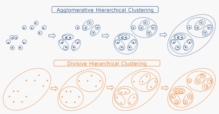
My main objective is identify the structuring dimensions of passenger satisfaction and in next post, I will also perform a cluster analysis in order to segment the passengers into homogenous groups based on their satisfaction levels (or structures) found in this analysis and characterize them based on sociodemographic variables, using an hierachical clustering method.

About the dataset:
The original data reflect a great deal of information about waiting times, cleanliness of spaces, flight types, airlines, sociodemographic data and satisfaction levels, perceptions, preferences and suggestions of travelers interviewed. Since, as already mentioned, the objective of the study is to identify the structuring dimensions of passenger satisfaction I decided not to use all the variables present in the questionnaire, but only those that will allow me to meet the objectives:

RESPNUM: Respondent Number (automatically generated)
TRIP_PURPOSE: What is the main purpose of your trip today?
GET_AIRPORT: How did you get to the airport today?
CHECK_BAGAGE: While at SFO today, did you check bagage?
PURCHASE_STORE: While at SFO today, did you purchase anyhing from an airport store?
PURCHASE_RESTAU: While at SFO today, did you make a restaurant purchase
USE_WIFI: While at SFO today, did you use free Wi-Fi
Q7_ART: Rating SFO regarding Artwork and exhibitions (1-5 scale)
Q7_REST: Rating SFO regarding restaurants (1-5 scale)
Q7_SHOPS: Rating SFO regarding retail shops and concessions (1-5 scale)
Q7_SIGNS: Rating SFO regarding signs and directions inside SFO (1-5 scale)
Q7_WALKWAYS: Rating SFO regarding escalators/elevators/moving walkays (1-5 scale)
Q7_SCREENS: Rating SFO regarding information on screens/monitors (1-5 scale)
Q7INFO_DOWN: Rating SFO regarding Information booths (lower level - near baggage claim) (1-5 scale)
Q7INFO_UP: Rating SFO regarding Information booths (upper level - departure area) (1-5 scale)
Q7_WIFI: Rating SFO regarding accessing and using free WiFi at SFO (1-5 scale)
Q7_ROADSIGNS: Rating SFO regarding signs and directions on SFO airport roadways (1-5 scale)
Q7_PARKING: Rating SFO regarding airport parking facilities (1-5 scale)
Q7_AIRTRAIN: Rating SFO regarding AirTrain (1-5 scale)
Q7LTP_BUS: Rating SFO regarding long term parking lot shuttle (bus ride) (1-5 scale)
Q7_RENTAL: Rating SFO regarding airport rental car center (1-5 scale)
Q9_BOARDING: Rating SFO regarding cleanless of boarding areas (1-5 scale) Q9_AIRTRAIN: Rating SFO regarding cleanless of AirTrain (1-5 scale)
Q9_RENTAL: Rating SFO regarding cleanless of airport Rental Car Center (1-5 scale)
Q9_FOOD: Rating SFO regarding cleanless of airport Restaurants (1-5 scale)
Q9_RESTROOM: Rating SFO regarding cleanless of restrooms (1-5 scale)
AGE: Categorical
INCOME: Categorical
GENDER: Categorical
FLY: Did you fly 100,000 miles or more per year? Categorical

#Reading dataset
airport=read.csv("SFO2017.csv", header=T, sep=";")


#Data wrangling

#We need to set categorical variables as factors and name the levels of categories (levels)

airport$trip_purpose=as.factor(airport$trip_purpose)

levels(airport$trip_purpose)=c(" ","Business/Work","Pleasure/Vacation","Visit Friends or relatives","School","Conference/convention",                       "Wedding/funeral/graduation","Other","Escorting others", "Volunteer","Moving/immigration" )


airport$get_airport=as.factor(airport$get_airport)
levels(airport$get_airport)=c(" ", "Drove and parked", "Dropped off", "Connecting from other flight","Taxi", "Uber or similar","BART","Door-to-dorr van service","Free hotel shuttle","Rental Car center","Other","Limo/town Car", "Sonoma/similar airport bus","Company rented bus","SamTrans/other bus","Caltrain/train","VTA", "Carshare")

airport$age=as.factor(airport$age)
levels(airport$age)=c(" ", "Under 18", "18-24","25-34","35-44","45-54","55-64","> 65"," ")

airport$gender=as.factor(airport$gender)
levels(airport$gender)=c(" ", "Male", "Female","Other"," ")

airport$income=as.factor(airport$income)
levels(airport$income)=c(" ", "Under 50,000", "50,000-100,000","100,01-150,000","Over 150,000")

airport$fly_miles=as.factor(airport$fly_miles)
levels(airport$fly_miles)=c(" ", "Yes", "No","Don't know"," ")

#Summary statistics
install.packages("stargazer")
library(stargazer)
stargazer(airport,omit= "RESPNUM", type = "text", title="Descriptive statistics", digits=1)
If we look to N in descriptive statistics, we can understand that there are many variables with missing values. For the factor analysis and also for the clustering solution, we need to treat this missing values, so I will impute mean of variable for the NA values.

#Replacing missing values of the variables that will be used in analysis (rating variables) for(i in 8:26{airport[,i]=ifelse(is.na(airport[,i]),round(mean(airport[,i],na.rm=T),0),airport[])}
Next step will be explore the categorical variables that i chose to use in this analysis. An easy way to explore this variables is to use the equivalent to pivot tables of excel in R. I will use package rpivotTable and show you this powerfull tool, which is dinamic so allows us to change variables in columns and rows just like in excel.
#Load rpivotTable
install.packages("rpivotTable")
library(rpivotTable)
#create pivot table
rpivotTable(airport, rows="trip_purpose", col= "gender", aggregatorName="Count", vals="RESPNUM", rendererName="Treemap")
As you can see, we can drag the variables to rows or columns and choose type of visualization. In this case, I chose "Table Barchart" and I can see the distribution of number of respondents per trip purpose and age. We can see that the majority of respondents where flighting for pleasure/vacation and within this purpose,the majority of passengers were aged between 25 and 34 years old. 
Business/work trips were also very common with the majority of passengers flying for this purpose with age between 35-44 years old.

In graphic bellow,also computed with rpivotTable, we can see that the majority of respondents didn't purchase anything in stores.
rpivotTable also allowed to create the following table:
Here we can see that the majority of passangers surveyed have an annual income of over $150,000 and didn't fly 100,000 miles or more per year. As it was expected, the majority of the passengers that flew more than 100,000 miles have the higher annual income.

Finally, we can also cumpute a regular table with the distribution of gender, where we are able to see that the majority of passengers are male:
#Factor analysis install.packages("psych") install.packages('GPArotation') library(psych) library("GPArotation") install.packages("corrplot") library(corrplot)
In order to understand if the variables of rating can be grouped on the basis of their correlations, that is, if there are variables strongly correlated with each other, but that have small correlations with other groups of variables and if each of these groups represents a latent factor / variable, the first step is to analyze the correlations between the various variables, taking into account that the more correlated they are, the higher the probability that the FA will produce relevant results
#Computing correlation
cor=cor(airport[,8:26]) corrplot(cor, type = "upper",tl.col = "black", tl.srt = 60)

We can see that some variables are highly correlated, such as Q7_art with Q7_shops and Q7_restaurants, Q7_signs with Q7_walkays and Q7_screens, and so on. At this phase, it seems that a FA makes sense. Nevertheless, there is a measure of the adequacy of FA to the dataset used, known as KMO.
This measure is more useful in the presence of large samples and produces an overall measure, but also variable by variable so one should begin by analyzing the measure for each. For variables, the acceptable values of KMO are greater than 0.5 and overall, values larger than 0.8 indicate a quite adequate data to FA. # Verifying adequecy of factor analysis KMO(cor)
From the output, we can see that for overall and variable, KMO's values are greater than minimum acceptable, indicating that we can procede with the analysis.

For conducting the FA, we need to choose the method that we will want to use. There are two types of FA: Principal component analysis (PCA) and Common and Specific Factor Analysis (CSFA). PCA may be more suitable when the main goal is to reduce the number of analysis variables to the minimum number of components representing the variance in the original data; when it is expected that all the variables are interrelated, reducing the likelihood of specific factors (specific variances are very small); when you want to produce a small number of indices that represent as completely as possible the variability of the original data; or when the main objective is to produce a small number of not correlated components, which represent the variability of the original data, for use in subsequent multivariate analysis (for ex. regression or cluster analysis).
CSFA may be more suitable when one admits the existence of specific factors that influence the levels of the original variables; when the goal is not only to reduce the original data to a smaller set of factors, but also the identification and interpretation of the meaning of the common factors that explain (even partially) the original variables, i.e. explain the correlations (or covariances) between the original variables.In this context it is necessary to choose a method of estimating the communalities and a method for extraction of factors (many methods available such as Principal component, Maximum-likelihood, Unweight least squares).

Because my main goal "is not only to reduce the original data to a smaller set of factors, but also the identification and interpretation of the meaning of the common factors that explain (even partially) the original variables", I will perform a CSFA using principal component method for the extraction of factors (most common). But first, we need to choose the numbers of factors that we want to retain, i.e, the number of latent variables that will represent the correlation between the original variables of the dataset. For this, we have also some rules of thumb which I will explain right away:
1. previous hypothesis about the number of dimensions 2. retaining factors with eigenvalues greater than 1 (with standardized data) or with eigenvalues greater than the averagevariance (with original data) 3. choosing the number of factors so that the accumulated percentage of variance reaches a satisfactory level (in human variables is customary to consider solutions representing at least 50% of the variance of the original data) 4. using a graph with successive eigenvalue decomposition (scree plot); retain a number of factors, after which there is a sharp decline in the slope of the curve 5. after choosing the number of factors with these criteria, solutions with different number of factors (in the neighborhood of the suggested criteria) should be produced and take the final decision based on the interpretation of the solutions.

#Retain factors with eigen values > 1 (I am not using standardized data but when using correlation matrix instead of covariance, it is the same as using the standardized data) eigen <- eigen(cor) eigen$values
#Solution : m=4factors (four eigenvalues greater than 1)

#Cumulative propotion of eigenvalue cumulative.proportion <- 0 prop <- c() cumulative <- c() for (i in eigen$values) { proportion <- i / dim(airport[,8:26])[2] cumulative.proportion <- cumulative.proportion + proportion
prop <- append(prop, proportion) cumulative <- append(cumulative, cumulative.proportion) } data.frame(cbind(prop, cumulative))
#We can see that 4 factors account for 40% of sample variance when m=4 factors
#Scree plot par(mfrow=c(1,1)) plot(eigen$values, xlab = 'Nr.Factors', ylab = 'Eigenvalue', main = 'Scree Plot', type = 'b', xaxt = 'n') axis(1, at = seq(1, 19, by = 1)) abline(h=1, col="blue")
#Final solution m=4

The initial solution of a factor analysis, rarely results in factors that are interpretable. One should produce a rotation of factors (originates a redistribution of variance), seeking to produce a new solution where each factor presents high correlations with only a part of the original variables. The rotation redistributes the variance of original factors to the new ones, aiming to achieve a more meaningful patter. Several rotations can be tried, and one retains the one which leads to the most interpretable and useful solution (considering the objectives of the analysis).

After performing the rotation with Varimax, Quarimax and Equamax method, the method chosen based on interpretation and useful solution was Varimax. After the rotation, it is usual to interpret the factors attributing a label to each of them, that should translate the main idea/information underlying the factor. To this end, we analyze all the original variables and identify the factor or factors where the variable show the most significant loading. Factor loadings equal or larger .5 are usually considere significant. Variables that do not exhibit a significant loading on any factor o with very small communality (<50%) should be removed from the analysis. In the interpretation of each factor, one should consider that each original variable has as more importance as larger is its loading.
#Rotation factor_analysis = principal(airport[,8:26], nfactors =4, rotate = "varimax") loadings=print(factor_analysis$loadings,cutoff=0.5)
Factor 1 - Internal Services
We can see that for factor 1 (RC1), variables with loadings >0,5 are Q7_signs, Q7_walkways, Q7_screens, Q7info_down, Q7info_up, Q7_wifi, which represent internal services (inside) of the the airport such as singns, information given in screens or in bording areas or bagage claim areas, and wifi.

Factor 2 - Cleanless services
We can see that for factor 2 (RC2), variables with loadings >0,5 are Q9_boarding, Q9_airtrain, Q9_rental, Q9_food and Q9_restroom, which represent all variables related to ratings in cleanless services in areas such as boarding areas, airTrain, rental Car center, restaurants areas and restroom areas.

Factor 3 - External services
We can see that for factor 3 (RC3), variables with loadings >0,5 are Q7_roadsigns, Q7_parking, Q7_airtrain, Q7LTP_bus, Q7_rental car, which represent all variables related to ratings of services outside the airport, such as signs in roads, parking facilities, airTrain, bus of the airport or rental car center.

Factor 4 - Entretainment services
We can see that for factor 4 (RC4), variables with loadings >0,5 are Q7_art, Q7_rest and Q7_shops which represent all variables related to ratings of arts and exhibitions, restaurants or retail shops in the airport.

Now that we have "replaced" the 19 variables of rating for 4 factors that represents the 4 latent variables, we can create homogeneous groups of passangers based on this 4 factors and after that, characterize them regarding sociodemographic characteristics. I will let this for my next post :)


7th Project: Multinomial Logistic Regression - Predicting Crime in Sydney

Sydney Crime Spot Sydney Crime Spot Mafalda Silva 14th November 2018 T...